Different Aspect Ratios on different eReader Devices
A new thing for most illustrators while working for a digital medium is the vast number of different screen sizes and aspect ratios of the screens. As long as you release a e-book for one specific device its like working for a traditional book, you got your size of the page and can work with it. But the moment you release your book on multiply platforms you will see your book on different devices with different screens, even if you release it on a single platform which is available for different devices you will have to adjust your work for it.
Most people old enough to remember video tapes and 4:3 tv sets are already aware of this problem. Back in the day you could often find different versions of the same film, one with black bars on top and below (letterbox) and one without (pan&scan), trying a different path to resolve the problem of getting the wide screen movies made for the cinema into your small tv set at home while preserving most of the action on the screen (letterboxing) or trying to fill most of the screen (pan&scan). Later some films where shot already with tv sets in mind (now more popular than ever with 16:9 sets more close to the movie aspect ratios) and could be opened up on top and below the movie image – its called open matte.
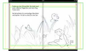
Enough of movies and tv sets, back to eReaders and the same problem with the same solutions. Even easier if you work on a new project with this problem in the back of your mind. Lets have a look at one example from our e-book “Freda die kleine Wunschfee“/”Freda the Little Plump Fairy“:
red = Apple iPad, green = Kindle Fire, yellow = Samsung Galaxy Tab 10.1
You see the different possible approaches to the problem of different ARs – you can either take something of at the bottom&top or add something to the left and right. What i recommend is to paint directly with different ARs in mind and as such a bit bigger with a bit of surroundings so you can choose a slightly different frame (reframing in movie speak) for each device.
You may recognize another little problem in the picture above – the fold in the middle of the two-page spread, its something special to iBooks on Apple devices, die Kindle doesn’t have one because it doesn’t have two-page spread. Lets have a look at the possibilities with this to change your layout from the “big” iPad to the “small” Fire.
Different device = Different AR, different frame, different layout, different typo size and if the illustrator is your wife you may get a little bit of photoshoping (spinning wheel in the lower right corner) for free…
If you are free to adjust the book layout in such ways you are always able to achieve a much better result in the end and a lot smoother user experience. Doing a 1:1 print to all devices recreation is in my humble opinion in 99% of the cases not the right way to do it. Some clients may be resistant to a good advice, but some may take your advice and in the end you have a better product and a happy client.


jf7ihs